New Website for The Art of Building in Loughborough, Leicestershire

After providing The Art of Building with a bespoke business management software solution, we were asked if we could also build their new website; working alongside Richard Jackson who was already working on their rebranding.

The Art of Building New Website

The site is very responsive, scaling to fit virtually all screen sizes from smartphones up to 27 inch, high resolution screens. Most pages of the website feature a large, single gallery that fills the majority of the screen, so the typical responsive column layout wasn’t appropriate as there isn’t enough content for it to automatically rearrange. Instead the page scales with the screen size, using the large images as a datum for calculating widths and heights. The result is a website where the beautiful photos fill your view, regardless of the screen you’re viewing it on.

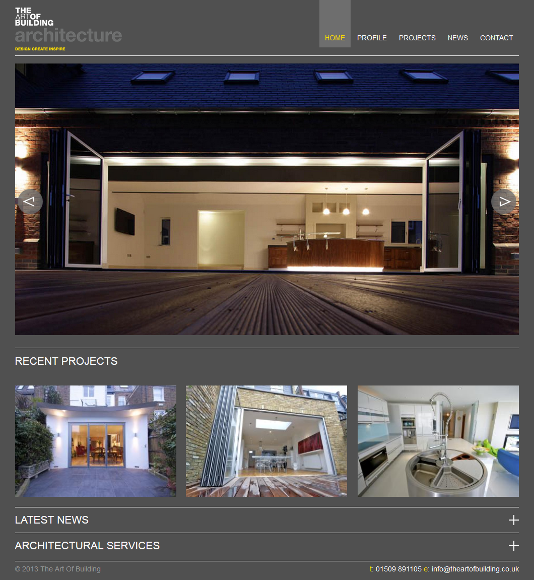
The new website for The Art of Building is all about showcasing their work, so the website is designed around exploring the projects. The home page features an auto-scrolling gallery of selected photos from projects, as well as the three most recent projects.

Clicking a recent project takes you to a page where you can view a full gallery of photos and details for that project. The details appear over the gallery, but can easily be hidden so the photos can be fully appreciated. Below the gallery is a navigation bar allowing you to conveniently browse through similar projects or share the project across all the major social media sites.

The project list can be browsed in full, split into residential and commercial or even viewed by category, such as ‘Extension’. Users can also jump straight to any of these from the drop down menu in the main navigation.

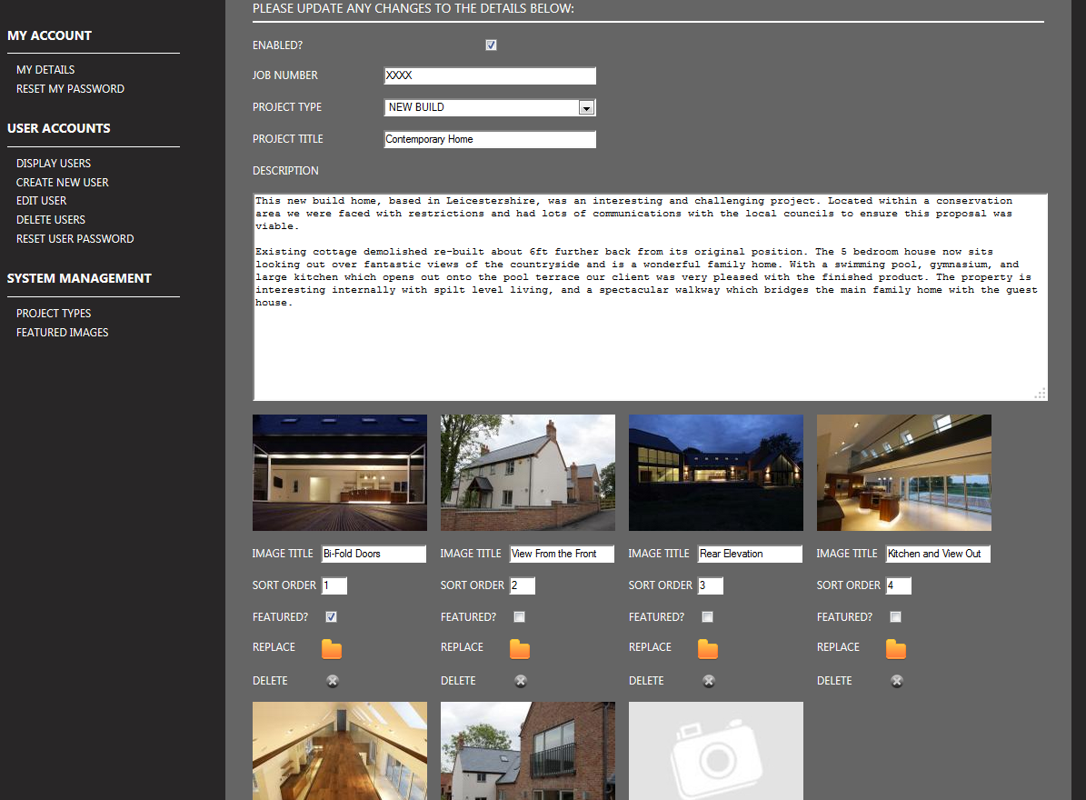
The projects and their photos are all uploaded and managed from a custom built content management system that is bespoke for The Art of Building and their new website. The content management system allows them to upload a single photo that is used automatically generate images at various sizes for different uses across the site. It also allows The Art of Building to reorder photos and give them titles for accessibility and search engine optimisation.

Bespoke content management system

In addition to managing projects, The Art of Building are also able to update the website via an embedded WordPress blog, which also feeds summaries of the most recent blogs onto the home page. The WordPress blog is labelled as the ‘News’ section of the site and has been styled in line with the rest of the site.

The new website is built to a high quality, reflecting the service it sells, using high resolution photos, images and icons to cater for larger screen sizes and high density screens, such as the Apple Retina screens and the Google Pixel. The website is a good reflection of The Art of Building and everyone involved is very pleased with the result.

New Website for Signs Direct (Lincoln) Ltd

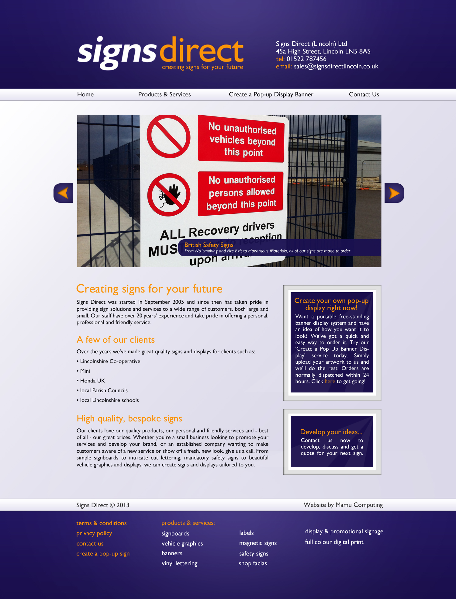
A brand new site for Signs Direct (Lincoln) Ltd has just been launched by us and is ready for business! Designed around the font and colours within the Signs Direct logo, the site has bold purple and orange highlights but still remains an elegant commercial design. Within the homepage a manually rotating feature displays Signs Direct’s key products and services, and small boxes to the right hand side of the main welcome text are designed to look like signs behind glass. These boxes lead viewers to other pages within the site, creating a better directed flow to key pages and products. The footer also emphasises the range of products and services that Signs Direct offers, with each item linking to the relevant section within the Products & Services page.

Homepage for Signs Direct Lincoln

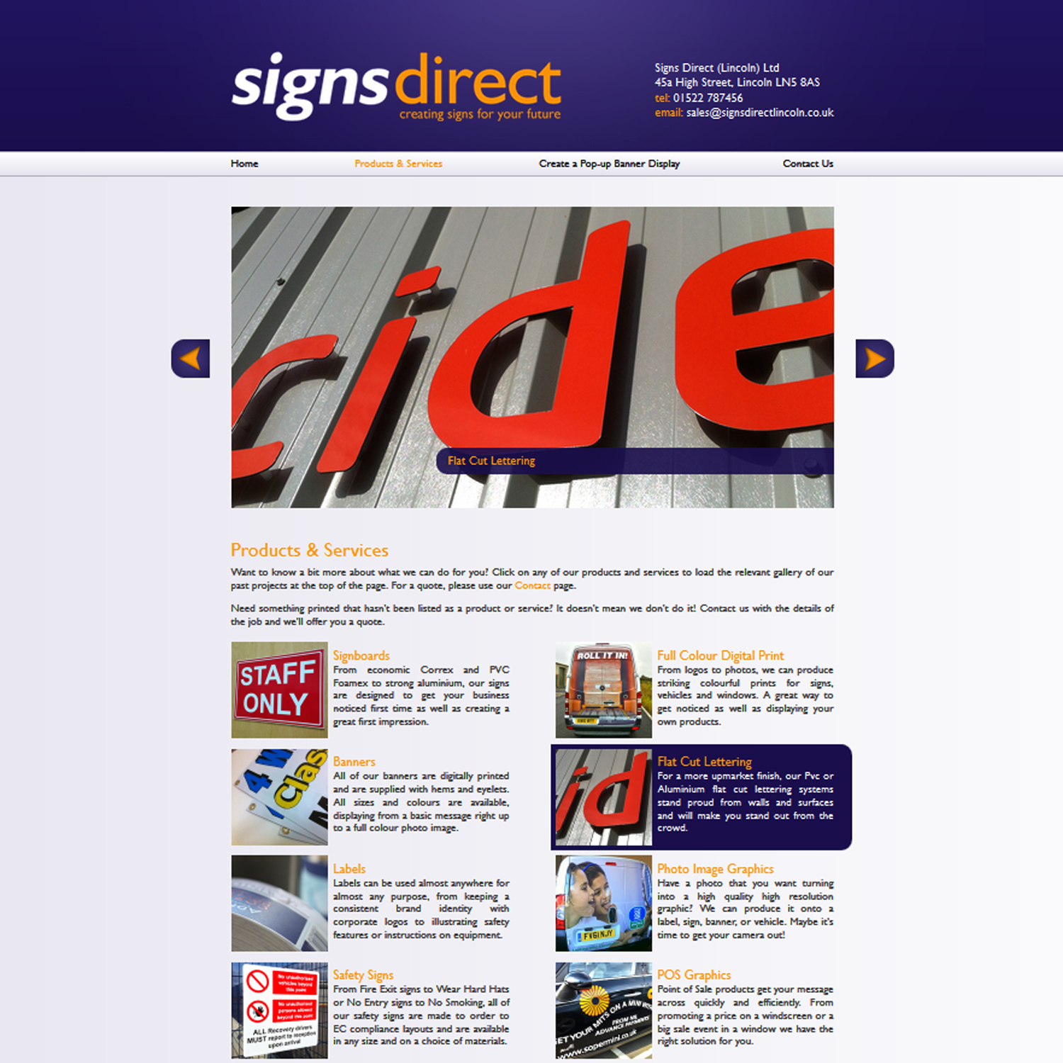
The site has two main features: a portfolio of previous notable work, and online ordering of pop-up banner displays. The portfolio is found under the Products & Services header. This page is arranged as a series of galleries, each selectable by clicking on the relevant picture and with a small description to the right hand side. All galleries are scrollable and easily navigated, particularly as the viewer stays on the same page at all times, with only the gallery changing.

Screenshot of the Products & Services page for Signs Direct Lincoln

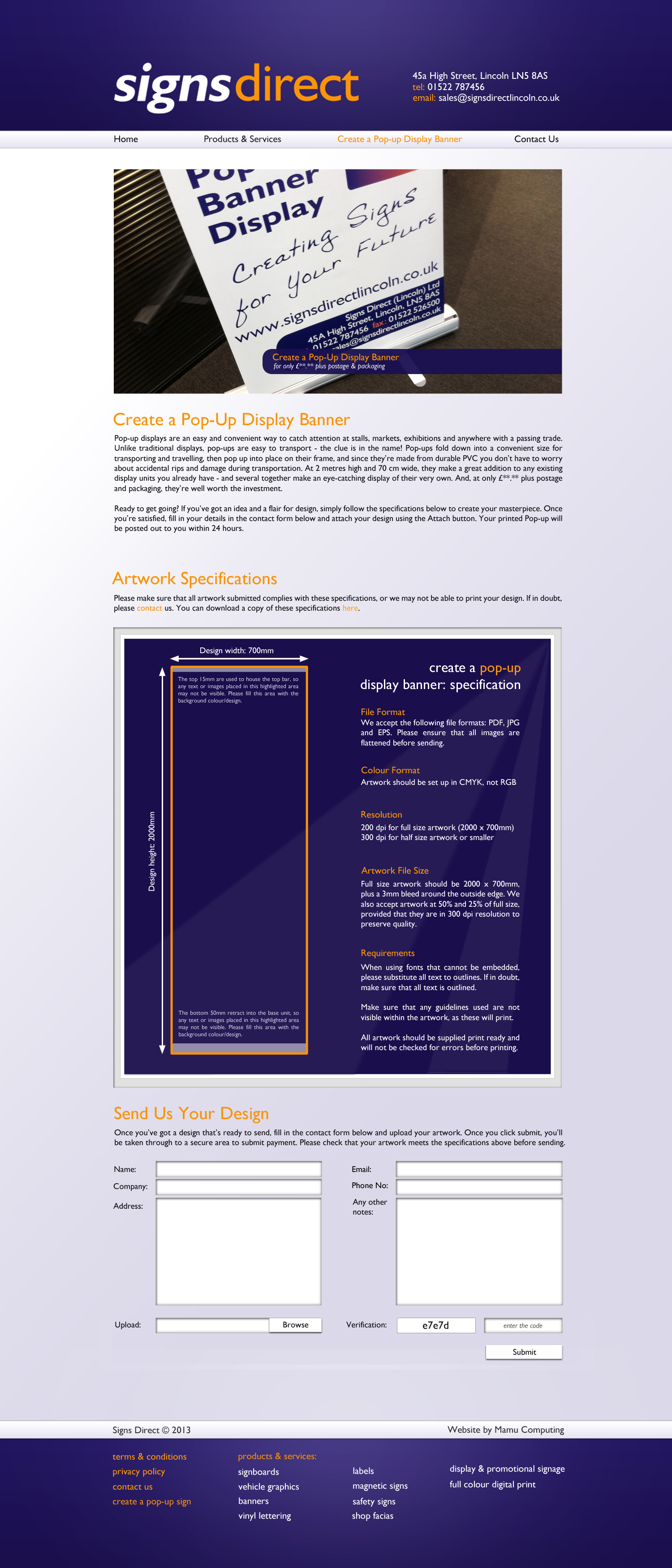
The Create a Pop-Up Banner Display is the online shop arm of the website, allowing clients to upload their designs directly and to make online payments, receiving their pop-up signs direct through the post. For this a specification was designed so that clients know the limitations they have to design to, which follows the colour and font theming within the rest of the site. This specification can be downloaded, so that clients can always have this on hand whilst designing. Once clients have uploaded their designs, they are taken through to a payment page, where they can opt to either pay by PayPal or contact Signs Direct to pay by other methods, such as by cheque.

Create a Pop-Up Display Banner page

The final page is a Contact page, which is a standard contact form that has verification added to it to substantially decrease and discourage spammers from using it to send mail.

Our client is very pleased with the resulting site and with our service throughout the design and development process.

New Website for Social Care Strategies

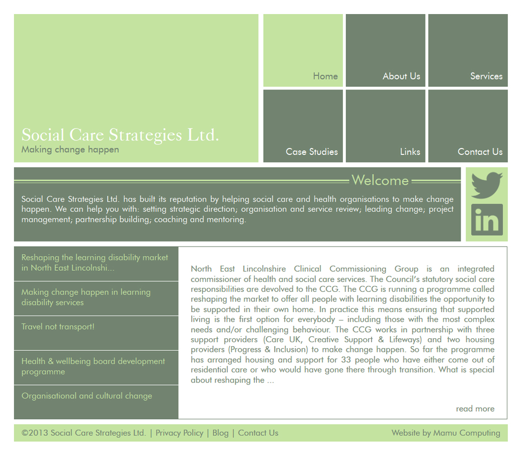
Homepage for Social Care StrategiesSocial Care Strategies, a Lincolnshire-based consultancy for social care and health organisations, has recently commissioned a redesign of their website from us, and their new site has just been launched this week. Based around their branding colours of white, light green and dark green, we drew inspiration from Metro-style tiling to create a modern, sleek and easy-to-use site that feels clean and minimal without being stark or boring. The traditional navigation menu has been replaced with a series of tiles to the top right that change colour on hover or selection, adding a feeling of movement and dynamism to a site that could otherwise feel fairly static. This is complemented by the news feed at the bottom of the page, which rotates through each news item on hover. This makes the site feel responsive rather than stiff. This feature is also present on the About Us and Services pages.

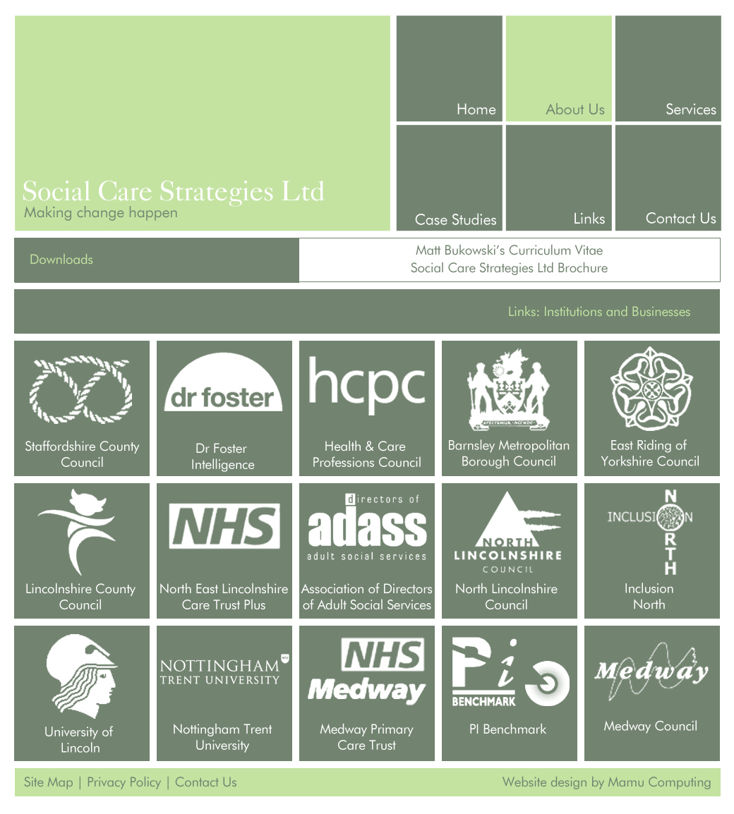
Links page for Social Care StrategiesThe colour themes within the site are consistent, from the navigation tiles in the top right to customised social media icons. Even the links page has taken the logos of each linked company and transformed them into a fully customised, consistent page of dark green tiles and white icons. Since Social Care Strategies has no logo per se, this helps to reinforce the branding of the company as well as keep a uniform feel from page to page. This approach was also taken with the two company fonts, which have been used as webfonts for a consistent feel to cross-company branding, from business cards and leaflets to the website itself.

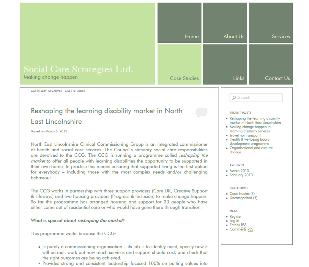
Case Studies page for Social Care Strategies

In order to provide an effective, easily updatable Case Studies page, we utilised the blog not only to feed into the home page, but also to filter posts that were tagged as case studies appear on the Case Studies page. This kill-two-birds-with-one-stone approach allows the company to easily update and manage their site without needing any specialist or technical knowledge, and without the expense of having a complete back-end editing system built specially for the site.

New Website Design Lincoln for Style-Arrival

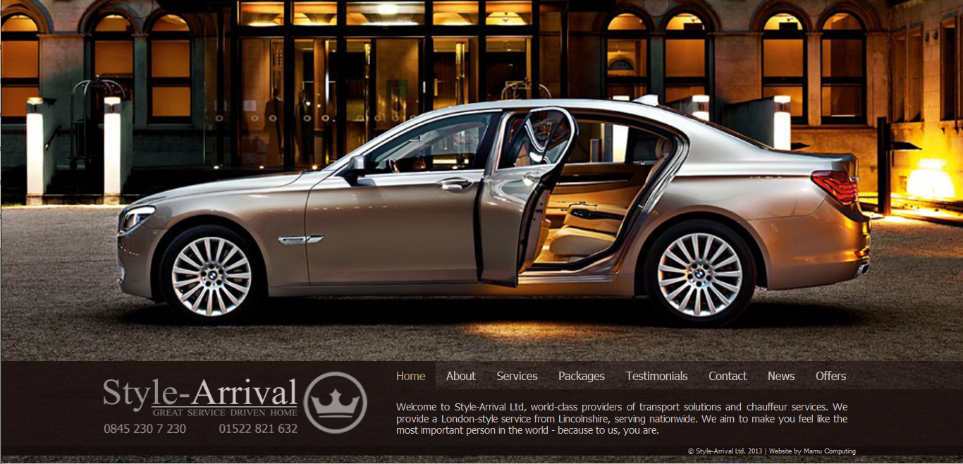
Style-Arrival Homepage

Our new website for Style-Arrival has been launched this week, replacing their previous website. Style-Arrival provide a variety of chauffeur driven services across the UK, including airport transfers, corporate travel and wedding car hire. Style-Arrival approached us after receiving rebranding proposals from students at the University of Lincoln, of which Style-Arrival liked elements, but none of them provided the full package. We took the elements they liked and used them as a basis to create the new website. The design of the new website is stylish and minimalist, using semi-transparent panels over the large background image. The homepage is particularly minimalist, displaying only the banner (containing the logo and navigation), allowing full view of the background image. The banner is present across the site and contains the company logo, phone numbers, site navigation and a short piece of text that changes depending on the page being viewed. The colour scheme of the site is inspired by the background image, picking out shades of gold, silver and brown.

Style-Arrival Airport Transfers

The page content throughout the site appears above the banner, covering the majority of the background image with a semi-transparent background colour. It was important to make the page content stand out from the background image, particularly as many of the pages contain photos. To achieve this, a shadow was placed around the content panels and filter was positioned over the background image. The content panels typically consist of a sub-menu on the left, a gallery along the top and text below. The sub-menu has the crown logo in the bottom right, slightly clipped, to match the company’s business cards. The content panels vary in size depending on the user’s screen size and to accommodate shorter screens (particularly widescreen laptops) the text area gets a custom scroll bar, which has a narrow track and replaces the rectangle with a miniature crown logo to tie in with Style-Arrival’s new branding. The circle element of the new Style-Arrival logo was also used to create custom social media icons for the Contact page.

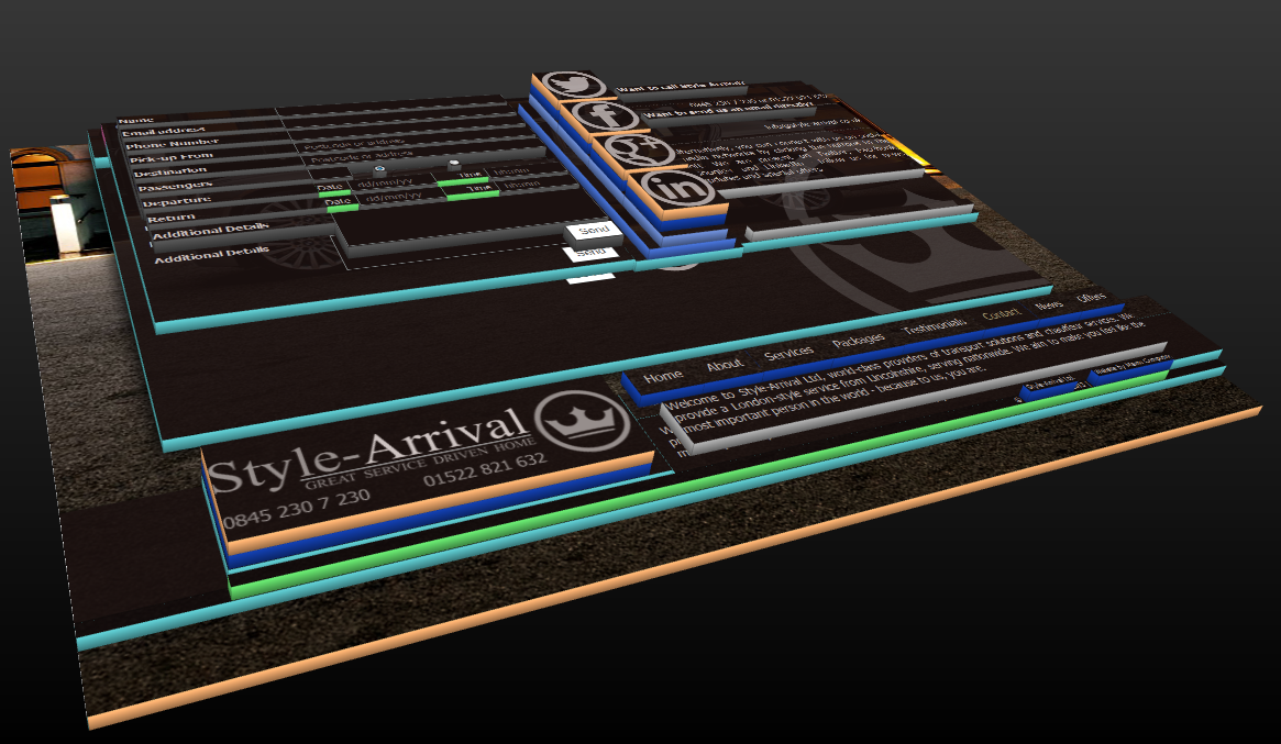
The site posed a few technical difficulties, mostly due to the ‘scale to fit’ nature of the site and the support for transparent backgrounds varying from browser to browser. The site is fairly consistent across all major browsers; however, in Internet Explorer 7 and 8 often a choice had to be made between a transparent background and an image, leading to the logo being dropped from some backgrounds or slight differences in transparency levels (due to layering). The image below shows the Contact page in 3D, depicting how the site is layered.

Style-Arrival 3D Webpage

Like all Mamu Computing websites, the new Style-Arrival site has been optimised for search engines and traffic is monitored so Style-Arrival can see just how many people are using their new website.

Unfortunately the existing WordPress blog was not part of our remit, although we did give it a bit of an overhaul: increasing the search engine optimisation, updating the navigation menu and providing guidance on effective blog writing techniques.

Style-Arrival have been very pleased new website and high level of service we provide, so much so they have already recommended our services.

Microsoft Replacing Messenger with Skype

Only six months ago we wrote an article about Microsoft replacing Hotmail with Outlook.com; now Microsoft have announced Windows Live Messenger (previously MSN Messenger) is to be replaced by Skype, which Microsoft bought in 2011. Messenger is being replaced globally, with the exception of mainland China.

Currently, Messenger users can continue to use Messenger, upgrade to Skype or merge their Messenger account with their Skype account. After 15th March 2013 [edit] 8th April 2013 all Messenger users will have to upgrade to Skype in order to continue using the services, but don’t worry – the process is fairly simple and we will run through the options (with pictures) below.

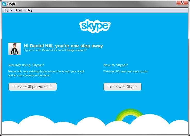
Firstly you need to make sure you have Skype installed, available here. If you already have Skype installed, make sure you have the latest version by going to ‘Help’ then ‘Check for Updates’. Next, open Skype; if it automatically logs you in then log out (‘Skype’ then ‘Sign Out’). You should now see a login screen like the one below:

Skype Login Screen

You need to select ‘Microsoft Account’ from the right hand side, which is the account you use for Messenger. After logging into your Microsoft Account you will be given two options.

Skype options to merge or upgrade Microsoft account

If you do not already have a Skype account simply click the ‘I’m new to Skype’ button to convert your Messenger account into a Skype account. If you already have a Skype account then you have two options available to you. The option on the left, labelled ‘I have a Skype account’ will merge your existing Skype account with your existing Messenger account. The alternative is to convert your Messenger account into a separate Skype account by clicking the ‘I’m new to Skype’ button. Having separate accounts will mean you can choose which account to log into, but not both at the same time on a single computer or other device. This could be particularly important to some users as Skype lacks options for displaying different online statuses to different users or groups of users, despite being a popular feature request for many years. In fact, the only option available is to block contacts to whom you wish to appear offline.

After you have either merged or upgraded your Microsoft Messenger account you will be able to use Skype to communicate with all your contacts, regardless of whether they are still on Messenger or have upgraded to Skype.

Microsoft really appear to be rebranding everything they have to offer. The 2D panel design used on the new Windows 8 start menu (originally branded ‘Metro’) has gradually been applied across the board: computers, smartphones, tablets, games consoles, software, websites and even the Windows logo itself. On top of this Microsoft have been clearing out old offerings, with very well-known services, such as Hotmail and Messenger, being retired. For many, myself included, Hotmail and MSN Messenger were a staple part of early online social networking and it feels like an end of an era to see them go.

New Website Design – Harmless

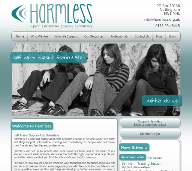
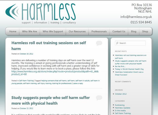
Harmless Homepage Screenshot

We have launched a new website for Harmless. Harmless are a user led organisation based in Nottingham that provides a range of services about self-harm including support, information, training and consultancy to people who self-harm, their friends and families and professionals. Harmless approached us looking for a complete revamp of their previous website that was five years old and no longer met all their requirements. The new website has been designed with three key areas: blog, shop and the core website. As well as designing the new website, Mamu Computing also designed a new logo for Harmless.

The principal part of the website starts with the home page, which prominently showcases the diversity within self-harm through a transition of large photos. The page also pulls together live data feeds from various sources including Twitter, Facebook and their Google Calendar, as well as the Harmless blog and online shop. Due to Twitter’s 140 character limit it was fairly straightforward to design how tweets would be displayed. However, the length of Facebook posts can vary greatly, so in order to maintain a consistent look Facebook posts were displayed in small, scrollable panels with custom designed scroll bars. The primary navigation for the website is situated along the top and divides the site into its major sections, each of which has its own sub-menu.

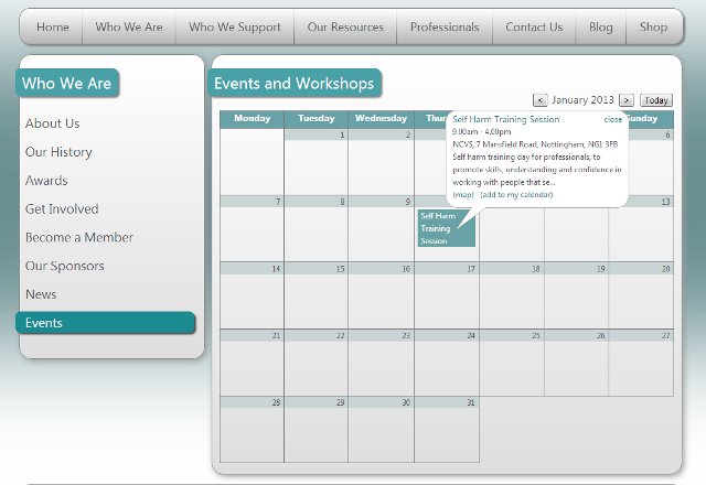
Custom Google Calendar

The events page (under ‘Who We Are’) displays a custom calendar that uses a Google Calendar data feed, allowing Harmless to easily update the upcoming events using their existing Google Calendar. The custom calendar shows all upcoming events in a ‘month view’ layout, with the ability to browse through future months. Clicking an event reveals additional details in a pop-up bubble, which includes time, description and location, as well as a link to Google Maps and the option to add the event to your own Google Calendar.

The new website provides various forms of media for download, including brochures, forms, videos and audio files as well as being able to watch, read and listen online. The website’s contact page includes a contact form (which was particularly important to Harmless as it allows people to get in touch without a record being saved in their sent items) as well as email, telephone, postal address and social network details, allowing users to get in touch by whatever means best suits them.

Harmless Blog Screenshot

The new website’s blog allows Harmless to keep their users up-to-date with all the latest news from Harmless and self-harm related news. The blog also provides a forum for discussion, allowing people to become a member and comment on news articles. The blog is designed with the same style and layout as rest of the website so that it very much feels part of it. The header and footer match the main part of the site to provide a consistent navigation.

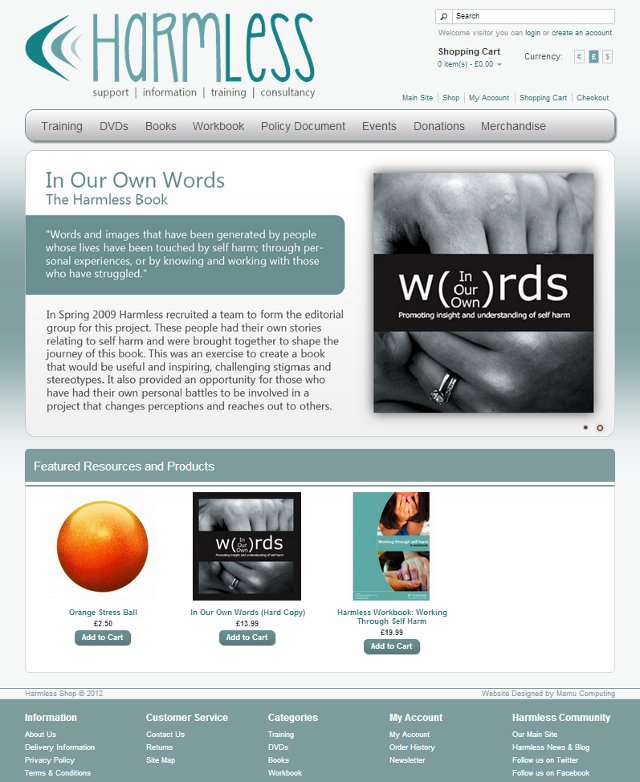
Harmless Online Shop Screenshot

The layout of the shop part of the website differs slightly from the rest of the website, most notably in the header, footer and navigation bar. However, the style is consistent with the rest of the site, maintaining the same colour scheme, graphics and use of panels with rounded corners. The reason for the difference is that the shop serves a different purpose: it aims to promote and sell the products and services that Harmless offer. For that reason the home page of the shop features a highly animated promotional space and an area for promoted products. The shop provides a great deal of functionality for its users, including account management, downloads and a newsletter, as well as plenty of management tools for the Harmless staff, allowing them to manage products, stock levels and customer orders.

The new website better reflects the Harmless organisation, allows them to keep their users up-to-date and streamlines the process of selling their products and services, which all helps them work efficiently and reach the people that need them.

Twitter RSS Feeds Have Moved

Today we noticed that a Twitter feed on one of our customer’s sites had stopped working. On closer inspection the PHP code used to interpret the feed was failing to find any relevant terms. Viewing the feed in a browser quickly highlighted that Twitter had stopped the feed. The URL of the feed that was being used was in the following format (the customer’s username has been replaced by ‘MamuComputing’):

https://twitter.com/statuses/user_timeline.rss?screen_name=MamuComputing&count=3

Which then displays the following:

Twitter RSS Feed Error

Fortunately, the Twitter RSS feed hasn’t been turned off, merely moved. After changing the URL of the feed to the format below everything worked fine again.

http://api.twitter.com/1/statuses/user_timeline.rss?screen_name=MamuComputing&count=3

Although, with Twitter disabling Tweets feeding into LinkedIn and Facebook turning off RSS feeds, both earlier this year, we will be considering a different approach to Twitter feeds for our customers.

New Website Design – AMSD

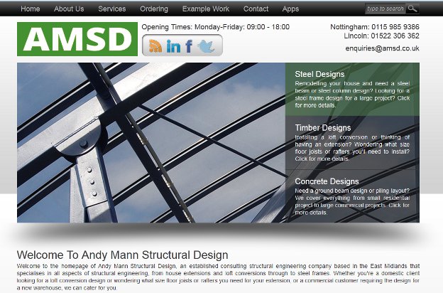
New AMSD Website

The new website for AMSD (Andy Mann Structural Design) has been launched this month. AMSD is a structural engineers in Nottingham that was looking for a new website to replace their existing one that was becoming outdated. Our design brief was to produce a site that felt modern and sleek, with an emphasis on style and images. The new website is designed using sleek black, grey and white colours, reminiscent of steel, with elements of green to tie in with teh AMSD colours. The new website is also functional, allowing customers to not only browse AMSD’s services, but also provide design specific details through forms that request information tailored to each structural design as well as allowing drawings and other specifications to be uploaded.

From a technical point of view the sites multiple forms are all validated before submission using both Javascript and PHP validation. The Javascript validation provides more responsive and user friendly feedback, while the PHP form validation provides a second layer of validation for cases where Javascript is either unavailable or being manipulated. All the forms throughout the site contain a Captcha to prevent automated spam beign sent through them. However, it was decided to make the Captcha images clear, rather than the more common obscured ones, so as to reduce user frustration.

As with all Mamu Computing websites, the new AMSD website has been developed to aid search engine optimisation, ensuring all pages have the appropriate titles, meta tags, alt tags, etc. The site has also been configured to provide an analysis of its traffic so its performance can be measured. The new website is also ready for expansion, designed with the ability to add extra services with minimal effort, allowing the website to continue to grow alongside the company.

We wish AMSD all the best and hope they continue to grow and expand their services.