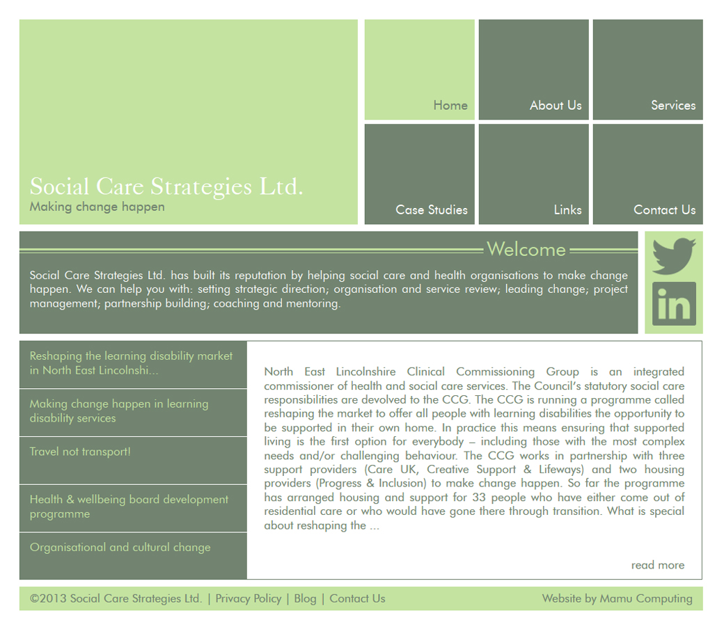
 Social Care Strategies, a Lincolnshire-based consultancy for social care and health organisations, has recently commissioned a redesign of their website from us, and their new site has just been launched this week. Based around their branding colours of white, light green and dark green, we drew inspiration from Metro-style tiling to create a modern, sleek and easy-to-use site that feels clean and minimal without being stark or boring. The traditional navigation menu has been replaced with a series of tiles to the top right that change colour on hover or selection, adding a feeling of movement and dynamism to a site that could otherwise feel fairly static. This is complemented by the news feed at the bottom of the page, which rotates through each news item on hover. This makes the site feel responsive rather than stiff. This feature is also present on the About Us and Services pages.
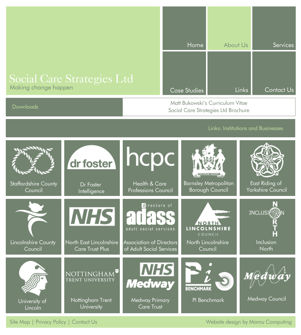
 The colour themes within the site are consistent, from the navigation tiles in the top right to customised social media icons. Even the links page has taken the logos of each linked company and transformed them into a fully customised, consistent page of dark green tiles and white icons. Since Social Care Strategies has no logo per se, this helps to reinforce the branding of the company as well as keep a uniform feel from page to page. This approach was also taken with the two company fonts, which have been used as webfonts for a consistent feel to cross-company branding, from business cards and leaflets to the website itself.
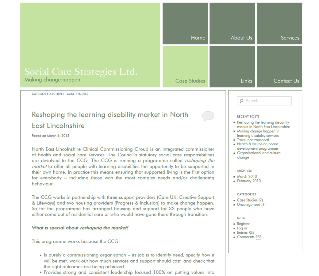
In order to provide an effective, easily updatable Case Studies page, we utilised the blog not only to feed into the home page, but also to filter posts that were tagged as case studies appear on the Case Studies page. This kill-two-birds-with-one-stone approach allows the company to easily update and manage their site without needing any specialist or technical knowledge, and without the expense of having a complete back-end editing system built specially for the site.

