We have launched a new website for Harmless. Harmless are a user led organisation based in Nottingham that provides a range of services about self-harm including support, information, training and consultancy to people who self-harm, their friends and families and professionals. Harmless approached us looking for a complete revamp of their previous website that was five years old and no longer met all their requirements. The new website has been designed with three key areas: blog, shop and the core website. As well as designing the new website, Mamu Computing also designed a new logo for Harmless.
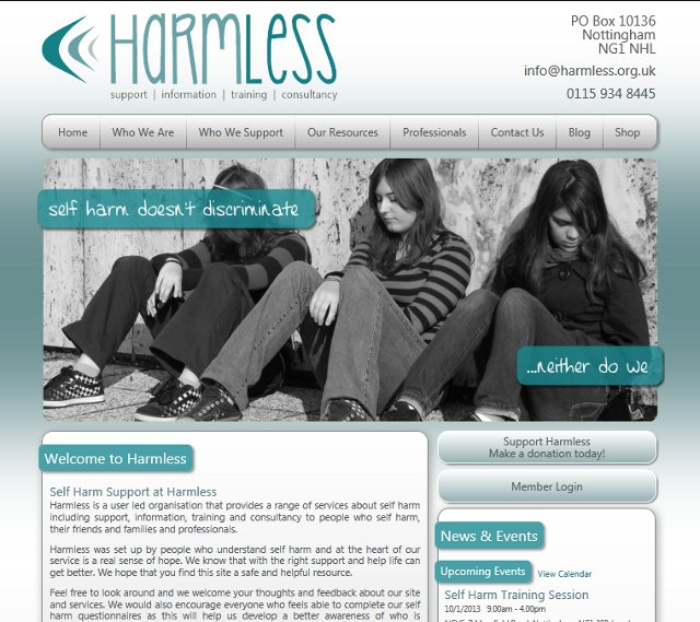
The principal part of the website starts with the home page, which prominently showcases the diversity within self-harm through a transition of large photos. The page also pulls together live data feeds from various sources including Twitter, Facebook and their Google Calendar, as well as the Harmless blog and online shop. Due to Twitter’s 140 character limit it was fairly straightforward to design how tweets would be displayed. However, the length of Facebook posts can vary greatly, so in order to maintain a consistent look Facebook posts were displayed in small, scrollable panels with custom designed scroll bars. The primary navigation for the website is situated along the top and divides the site into its major sections, each of which has its own sub-menu.
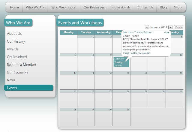
The events page (under ‘Who We Are’) displays a custom calendar that uses a Google Calendar data feed, allowing Harmless to easily update the upcoming events using their existing Google Calendar. The custom calendar shows all upcoming events in a ‘month view’ layout, with the ability to browse through future months. Clicking an event reveals additional details in a pop-up bubble, which includes time, description and location, as well as a link to Google Maps and the option to add the event to your own Google Calendar.
The new website provides various forms of media for download, including brochures, forms, videos and audio files as well as being able to watch, read and listen online. The website’s contact page includes a contact form (which was particularly important to Harmless as it allows people to get in touch without a record being saved in their sent items) as well as email, telephone, postal address and social network details, allowing users to get in touch by whatever means best suits them.
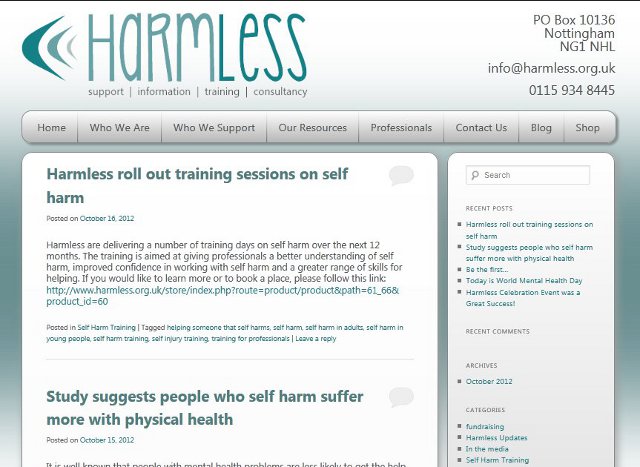
The new website’s blog allows Harmless to keep their users up-to-date with all the latest news from Harmless and self-harm related news. The blog also provides a forum for discussion, allowing people to become a member and comment on news articles. The blog is designed with the same style and layout as rest of the website so that it very much feels part of it. The header and footer match the main part of the site to provide a consistent navigation.
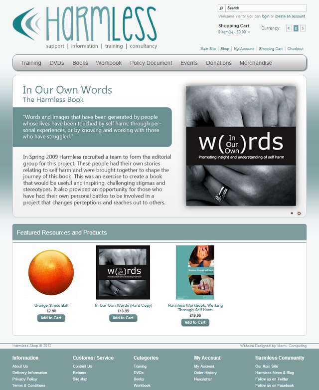
The layout of the shop part of the website differs slightly from the rest of the website, most notably in the header, footer and navigation bar. However, the style is consistent with the rest of the site, maintaining the same colour scheme, graphics and use of panels with rounded corners. The reason for the difference is that the shop serves a different purpose: it aims to promote and sell the products and services that Harmless offer. For that reason the home page of the shop features a highly animated promotional space and an area for promoted products. The shop provides a great deal of functionality for its users, including account management, downloads and a newsletter, as well as plenty of management tools for the Harmless staff, allowing them to manage products, stock levels and customer orders.
The new website better reflects the Harmless organisation, allows them to keep their users up-to-date and streamlines the process of selling their products and services, which all helps them work efficiently and reach the people that need them.


